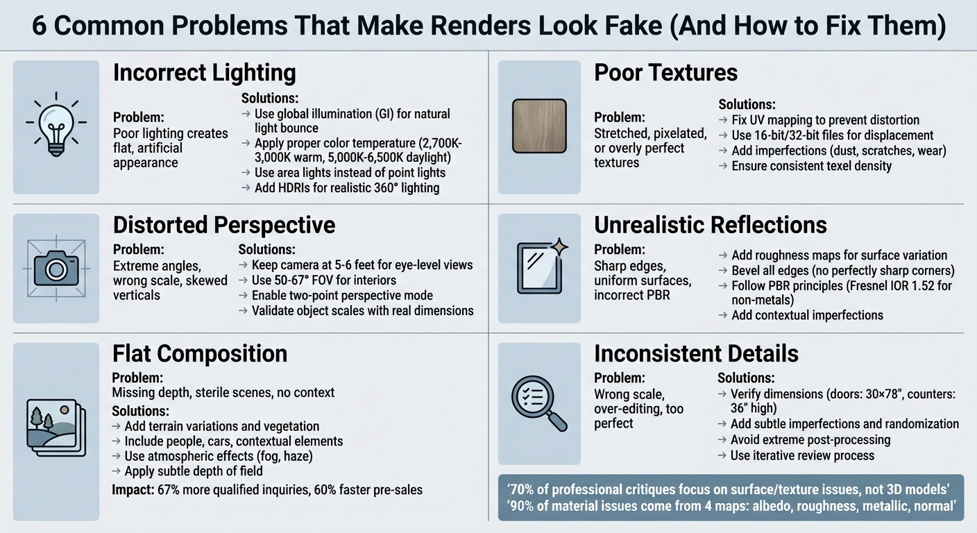
Why Renders Look Fake: 6 Common Problems Solved
When your renders look fake, it’s usually due to six common issues: poor lighting, low-quality textures, distorted perspectives, unnatural reflections, flat compositions, and inconsistent details. These flaws can make your designs unconvincing and harder for clients to trust. The good news? Each has a clear fix.
Key Problems and Solutions:
- Lighting Issues: Use natural light behavior, global illumination, and proper color temperatures.
- Texture Problems: Avoid stretched, pixelated, or overly perfect textures; add imperfections and ensure proper UV mapping.
- Perspective Errors: Keep camera heights realistic and use appropriate FOV and two-point perspective.
- Unrealistic Reflections: Add roughness maps, avoid sharp edges, and follow PBR principles.
- Flat Compositions: Add depth with terrain, vegetation, and contextual elements like people or vehicles.
- Over-Editing: Avoid extreme post-processing, maintain scale consistency, and introduce subtle imperfections.
Modern AI tools like Render a House can automate fixes for lighting, textures, and reflections in seconds, saving time and improving results. Whether you prefer manual adjustments or AI-powered platforms, addressing these issues will make your renders more lifelike and reliable.
6 Common Rendering Problems and Their Solutions
How to Render Realistic Interiors in Architecture
sbb-itb-a34ea2e
Problem 1: Incorrect Lighting
Lighting can make or break a render. Balanced lighting adds depth and natural shadows, while overly uniform lighting creates a flat, artificial appearance. As the Poliigon team puts it:
"Where there is light, there must be shadow. Although you may want everything to be lit evenly, that can create a bland, uninteresting image".
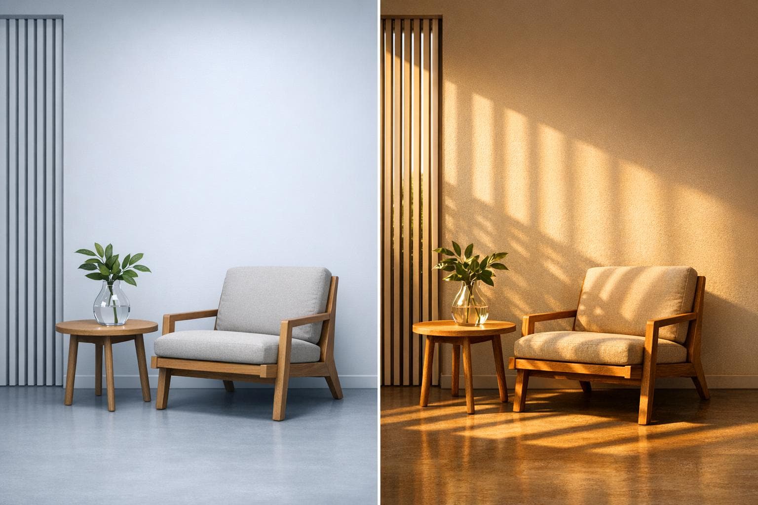
For instance, turning on interior lamps during daylight often ruins realism because artificial lights are insignificant compared to natural sunlight. Similarly, using point lights instead of area lights results in harsh, unrealistic shadows. Area lights, on the other hand, create softer, more diffused shadows. Another common mistake is ignoring the inverse square law, which causes distant objects to appear unnaturally bright.
How Natural Light Works
Natural light doesn’t just illuminate - it interacts with the environment in fascinating ways. It bounces off surfaces, picking up colors and spreading them throughout the scene. This process, called global illumination (GI), gives spaces a natural, lively feel. For example, sunlight reflecting off a red couch will subtly tint nearby walls with a red hue. Without GI, renders tend to look flat and lifeless.
Color temperature is another key detail. Measured in Kelvin, it determines the warmth or coolness of light. Warm interior lighting typically falls between 2,700K and 3,000K, while daylight ranges from 5,000K to 6,500K. Mixing these temperatures without careful balance can create a disjointed, unnatural look that viewers instinctively notice.
Understanding these behaviors is essential for fixing lighting issues effectively.
Fixing Lighting Issues
To correct lighting mistakes, start by mimicking how light behaves in real life. Use directional lights to simulate sunlight and area lights for windows or softboxes to replicate soft, natural illumination. For artificial lighting, rely on IES profiles to achieve realistic light patterns. Instead of flooding dark spots with extra lights, adjust your camera exposure - just as you would in real photography.
Modern tools like Render a House can simplify this process. This platform uses AI to analyze scenes and apply accurate global illumination, environment mapping, and color temperature adjustments. These tasks, which could take hours to fine-tune manually, are completed in seconds. Unlike competitors such as Rendair, ReRoom, ReRender, ArchiVinci, MyArchitectAI, ArchitectAI, PromeAI, D5, and ArchSynth, Render a House performs lighting calculations in the cloud, delivering professional results in under 10 seconds.
For exterior renders, High Dynamic Range Images (HDRIs) are invaluable. They provide realistic 360-degree lighting that enhances your scene’s realism. Lastly, don’t shy away from shadows - they add the contrast and depth that make renders feel authentic. Avoid the temptation to eliminate them.
Problem 2: Poor Textures and Materials
Lighting often gets the spotlight in rendering, but the quality of materials and textures is just as important for achieving realism. When textures are stretched, pixelated, or unnaturally perfect, they disrupt the illusion of authenticity. Even subtle mismatches or repetitive patterns can make viewers feel something is off.
Common Texture Problems
Several issues tend to crop up when working with textures:
- "Taffy Stretch": This happens when a square texture is forced onto a non-square or curved surface, causing distortion. For example, wood grain or brick patterns may appear warped.
- "Infinite Grid": Large surfaces, like walls or courtyards, can suffer from visible, repetitive tiling that breaks immersion.
- Texel Density Disconnect: This occurs when objects in the same scene have mismatched resolutions, like a sharp floor next to a blurry table.
- "Slick Plastic" Uniformity: Real-world surfaces have imperfections like dust, scratches, or wear. When materials lack these details, they look unnaturally flawless, creating unrealistic reflections.
As Tarik Can, a Full Stack Developer, explains:
"Most unrealistic renders share one thing in common. They are too clean... Real surfaces don't behave like this".
Technical problems can also undermine texture quality. Inverted normal maps can make mortar appear to stick out while bricks sink in. Displacement stair-casing happens when low-quality 8-bit JPGs are used for displacement mapping, leading to blocky transitions instead of smooth ones. Additionally, incorrect scale can make bricks look absurdly large or wood grain appear oversized.
Interestingly, about 70% of professional critiques on 3D projects focus on surface and texture issues rather than the 3D models themselves. Fixing these problems is just as crucial as perfecting lighting to meet client expectations.
Improving Textures with AI
Modern AI tools can tackle texture challenges in seconds, cutting down tasks that used to take hours. For example, Render a House uses AI to analyze scenes and generate high-quality, physically accurate materials. It automates complex processes like creating synchronized PBR maps (including albedo, normal, roughness, and metalness), ensuring materials interact with light naturally. Unlike some other tools, Render a House operates entirely in the cloud and delivers results in under 10 seconds. Its AI smooths out issues like visible tiling, texel density inconsistencies, and overly uniform surfaces by adding subtle imperfections that enhance realism.
For those using manual workflows, there are tried-and-true methods to improve textures. Start with the checkerboard test: apply a checkerboard pattern to your model before final texturing. If the squares appear distorted, your UV mapping needs adjustment. Use 16-bit or 32-bit EXR files for displacement mapping to prevent blocky artifacts, and ensure UVs are properly unwrapped to avoid texture stretching. Beveling edges is also important - real-world objects rarely have perfectly sharp corners, and even a small bevel helps edges catch light more naturally.
To minimize repetition on large surfaces, techniques like texture bombing (rotating and flipping tiles) or adding grunge overlays can help hide patterns. Micro-imperfections, such as dust, scratches, or moisture variations, also go a long way in making materials feel more authentic. As Hao Wang, Data Manager at D5 Render, puts it:
"Imperfections are not flaws - they are realism".
With textures addressed, the next step is tackling perspective distortions, another factor that can break the illusion of realism.
Problem 3: Distorted Perspectives and Proportions
While accurate lighting and textures are key to creating realistic renders, getting perspective and proportions right is just as crucial. When camera angles are too extreme, objects are improperly scaled, or vertical lines appear skewed, the result can feel noticeably off to viewers.
Common Perspective Mistakes
Even a small camera tilt - just 5° - can introduce unwanted three-point perspective, making vertical lines converge unnaturally. D5 Render notes that this slight tilt can cause walls to look 12–15% slanted, creating a warped appearance.
Another common issue is what Alex Hogrefe, founder of Visualizing Architecture, refers to as the "giant" camera height. Setting the camera too high, between 8 and 12 feet, results in an awkward viewpoint. Hogrefe advises:
"Don't be a giant. If you are going to create an eye level view, set the camera height to around 6′ to better connect the viewer to the experience of being at that space".
Field of view (FOV) settings also play a big role. A default 90° FOV can overstretch edges, leading to distorted interiors. Professionals often prefer a 67° FOV for a more natural look. On the other hand, using focal lengths that are too narrow can flatten the scene, robbing it of depth and dimension.
Scaling errors are another major pitfall. For instance, a car that's 15 feet long or a kitchen counter that's only 3 feet tall immediately disrupts the realism of the scene.
Correcting Perspective Issues
Now that we've covered the common mistakes, let's look at how to fix them.
AI-powered tools have made it much easier to address perspective problems. D5 Render, for example, includes a Two-Point Perspective Mode (activated with the "P" shortcut) that locks vertical lines automatically, eliminating the "leaning tower" effect. Hao Wang, Data Manager at D5 Render, explains:
"D5 Render enforces two-point perspective by adjusting the projection matrix during the geometry processing stage... ensuring ray-traced shadows and volumetric lighting calculations are based on corrected 3D geometry".
This method adjusts the geometry before rendering, avoiding the distortions that can arise from post-render fixes. Meanwhile, tools like ArchiVinci use deep-learning vision algorithms to detect vanishing points and rebalance camera setups for accurate depth. Platforms like Autodesk Forma and Spacemaker take it a step further by cross-checking geometry files to catch dimension mismatches before rendering begins.
For those working manually, a few simple practices can make a big difference. Keep camera heights at eye level (around 5–6 feet) for human-scale views or raise them above 25 feet for clear aerial perspectives. Adjust your FOV based on the scene: 50–67° works well for interiors, while exterior shots benefit from 30–100mm equivalent focal lengths. Always validate object scales using standard reference dimensions to maintain realism. Clipping planes can also be used to remove foreground obstructions without altering the 3D model. Lastly, enabling two-point perspective mode ensures vertical lines stay straight.
Next, we'll explore how reflections and highlights play a role in enhancing realism.
Problem 4: Unrealistic Reflections and Highlights
Realistic reflections are essential for creating convincing 3D renders. Even with accurate lighting and proportions, reflections and highlights can betray the illusion, making it clear that an image is computer-generated. Overly transparent glass or unnaturally glowing metals are common giveaways that something isn't quite right.
Common Reflection Mistakes
One frequent issue is the use of perfectly sharp edges. In the real world, objects always have some degree of rounding or beveling at their edges. Without this, light doesn't interact with surfaces naturally, leading to missing highlights and an overly artificial look. As Curved Axis aptly puts it:
"Perfectly sharp edges do not exist in real life, and should not exist in 3D."
Another common problem is the lack of surface variation. Real materials have tiny imperfections - like dust, fingerprints, or smudges - that subtly break up reflections, adding depth and realism. Ignoring these details can make surfaces appear unnaturally clean and smooth.
Incorrect roughness settings also lead to unrealistic results. Using a flat roughness value instead of a varied roughness map can make materials look unnatural, resembling "chrome-plated Jell-O" or liquid mercury. Additionally, violating PBR (Physically Based Rendering) principles by assigning metals a diffuse color is another misstep. Metals get their appearance entirely from reflections, so adding a base color results in a strange "plastic-metal hybrid" effect. Paul Keskeys, Editor in Chief at Architizer, points out:
"Two of the most difficult materials to accurately replicate in renderings are glass and mirrored surfaces."
Overexposed lighting can also create overblown highlights, washing out surface details and reducing depth. Similarly, making glass overly transparent or mirrored surfaces too flawless can make renders look unconvincing.
Interestingly, most material issues - around 90% - originate from improper configuration of four key maps: albedo, roughness, metallic, and normal. A simple three-light test can identify 80% of poorly defined materials.
| Material Type | Recommended Diffuse Value | Recommended Fresnel IOR |
|---|---|---|
| Non-Metals (Dielectrics) | RGB 30–240 (Avoid pure black/white) | 1.52 (Default) |
| Metals | RGB 0,0,0 (Pure Black) | 50–999 |
| Glass | Varies by transparency | 1.50–1.60 |
These errors highlight the importance of refining reflections for realistic renders.
Fixing Reflections with AI
AI tools have revolutionized how reflections and highlights are handled, making it easier to correct mistakes and add missing details. In just 26 seconds, AI enhancers can refine textures, lighting, and reflections. Advanced features like "Exact Render" modules analyze the geometry and scale of an image to automatically apply realistic material details, reducing the need for manual shader adjustments. Post-processing techniques can also soften overblown highlights and reduce the unnatural glow that often plagues digital renders.
To improve reflections manually, consider these steps:
- Use a chamfer modifier or a "round edges" shader to soften sharp edges and allow light to transition naturally.
- Opt for roughness maps rather than static sliders to introduce subtle variations in light scattering.
- Follow PBR rules: use a Fresnel IOR of 1.52 for non-metals and pure black (RGB 0,0,0) with a Fresnel IOR of 50–999 for metals.
- Add contextual imperfections, such as slight wetness or smudges, to break up uniform reflections.
- Ensure energy conservation, meaning materials shouldn't reflect more light than they receive.
Problem 5: Flat Composition and Missing Depth
Getting the lighting, textures, and perspective right is essential, but creating depth in your render is what truly brings it to life.
Even with proper lighting and textures, a render without depth can feel dull and uninspired. Scenes that only showcase the building, with no surrounding elements, often come across as sterile and fail to captivate viewers. Without features like terrain changes, vegetation, people, or vehicles, the scene lacks scale and context, making it harder for the viewer to connect with the space.
Recognizing Flat Compositions
A flat composition can often be spotted by a harsh, straight horizon line where the ground meets the sky. In the real world, natural landforms and atmospheric effects create softer, more gradual transitions. But in CG renders, these lines can feel stark and unnatural. Another common issue is perfectly flat ground planes, which can look more like skating rinks than real terrain. As Jonn Kutyla, Founder of PiXate Creative, puts it:
"The natural world is filled with imperfections and one of the biggest tells that an image is computer generated is the lack of these imperfections."
Another telltale sign is the absence of shadows from off-screen elements. Without shadows cast by nearby buildings, trees, or other objects, the scene feels isolated and disconnected. Adding proper depth and context can make a significant difference - real estate listings with 3D views that include these elements generate 67% more qualified inquiries than those without.
Camera height is another factor that can disrupt the sense of scale. Heights between 8–12 feet often feel unnatural and disengaging. Rendering expert Alex Hogrefe explains:
"Don't be a giant. It is hard to tell if the camera is placed on a balcony, if it is being held by a giant or being taken by a low-flying drone. It is important to clarify the intent by either dropping it to eye level or raising it up to 25 or 30 feet."
For human-scale views, aim for a camera height of 5 to 6 feet (1.5 to 1.8 meters) and use a natural field of view between 50° and 67° to avoid the distortion caused by wide-angle lenses.
Adding Depth to Renders
Once you’ve identified flat composition issues, there are several ways to add depth to your renders. AI-powered platforms like Render a House can also help simulate natural terrain variations, making it easier to achieve a more dynamic look.
Start by breaking up the horizon line. Use terrain sculpting tools or backdrop planes to create subtle hills, mounds, or distant objects that add layers between the foreground and background. Atmospheric effects like fog or haze can also help, as they naturally reduce the contrast of background elements, making them appear farther away.
Vegetation is another powerful tool for adding depth. Instead of a uniform, artificial "AstroTurf" appearance, use scatter tools to blend different types of plants and introduce random variations in spacing and scale. Details like fallen leaves, lawn mower streaks, or slight height differences in the terrain can make the scene feel more authentic. Adding nearby detailed elements, such as shrubs or flowers, can further reinforce the sense of scale.
Contextual elements like people, cars, roads, and fences anchor the design in reality. These details help viewers relate to the space and understand its scale. Hao Wang, Data Manager at D5 Render, explains:
"When [small details] are missing, the viewer might not know why, but the scene feels off - like a cardboard model instead of a real structure."
Finally, consider using a subtle depth of field effect to blur either the foreground or background. This technique helps guide the viewer's focus while enhancing the sense of scale. Detailed, realistic renders can make a big impact, with projects seeing a 60% faster pre-sales completion rate when these techniques are applied.
Render a House stands out by offering quick and effective depth-enhancing adjustments, distinguishing itself from other tools like Rendair, ReRoom, ReRender, ArchiVinci, MyArchitectAI, ArchitectAI, PromeAI, D5, and ArchSynth.
Problem 6: Inconsistent Details and Over-Editing
After nailing down lighting, textures, perspective, reflections, and depth, there's still one sneaky issue that can ruin the realism of your render: inconsistent details or over-editing. Even if everything else is spot on, these subtle missteps can break the illusion and leave your work feeling artificial.
Think about it - when a piece of furniture looks too big for the rug beneath it, or when colors are pushed to extremes with overdone contrast and saturation, the viewer's brain immediately senses something's wrong. Details like generic scale figures or repeated sculptures can also pull attention away from the architecture itself. These small inconsistencies add up, making the scene feel less believable.
Spotting Over-Editing Problems
One of the most obvious signs of inconsistency is incorrect scale proportions. For example, a massive coffee table on a tiny rug or a chair that looks like it's made for a dollhouse can instantly shatter the illusion. The solution? Double-check your dimensions against real-world standards. For instance, interior doors are typically 30 x 78 inches, kitchen counters are about 36 inches high, and dining tables generally stand at 30 inches. These references help ensure everything feels grounded.
Another pitfall is over-stylization. While dramatic lighting or extreme weather effects can create a "sci-fi" vibe, they often distract from the building's design story. As Paul Keskeys, Editor in Chief at Architizer, wisely points out:
"Sometimes 'less is more' when it comes to renderings!"
Similarly, overdoing post-processing - like adding too much bloom, glare, or cranking up the contrast and saturation - can make your render look more like a video game than a photograph.
Uniformity and perfection also scream "computer-generated." Surfaces that are too clean, with no scratches, dust, or subtle imperfections, feel sterile and unrealistic. Darren Thomas, CG Supervisor at LEGO Systems, emphasizes this point:
"The real world is messy, unlike the precise digital world of 3D and CGI. Achieving that extra level of believability... requires introducing imperfection"
Even high-quality, scanned assets can feel lifeless if they lack environmental context or realistic wear and tear. These details are crucial for maintaining both visual coherence and the trust of your audience.
Reviewing and Refining Renders
Catching these issues takes an iterative review process. Start by zooming in on your render to see how materials hold up at different angles. Stretched or pixelated textures are dead giveaways of rushed work. AI tools can also be a huge help here, flagging lighting errors, misapplied materials, or layout inconsistencies early in the design phase, saving you from headaches later.
To add realism, introduce subtle imperfections like noise, grain, or slight variations in surface textures. Randomize the placement, rotation, and scale of repeated objects - such as chairs or plants - to avoid that obvious "copy-paste" look. Ricardo Eloy from CGArchitect sums it up well:
"Post-processing enhances a render when used sparingly, but too much spoils realism"
Finally, don’t underestimate the value of external feedback. Show your work to colleagues or even people outside the design world. Fresh eyes can often spot inconsistencies or emotional "off-ness" that you might miss after staring at the same render for hours. Their input can help you fine-tune your work and ensure every detail adds to the overall realism.
Comparing AI Rendering Tools
Once common rendering issues are addressed, the next step is selecting the right AI tool to implement those fixes. The AI rendering landscape offers a variety of options, from affordable cloud-based platforms to advanced professional software, each with its own pricing models and features.
What Sets Render a House Apart
Render a House stands out by offering unlimited renders per view. For just $3 per upload (Pay As You Go) or a $39/month Pro subscription, you can create as many variations as you like without worrying about credit limits or rendering caps. This flexibility is perfect for experimenting with different lighting setups or material finishes.
In addition to its pricing model, the platform provides customizable environment settings - day, night, or suburb - allowing you to visualize your designs in various scenarios. Unlike many automated tools, Render a House also offers direct access to expert assistance. As Visualization Artist Luke Vercia explains:
"It is also very helpful to have a team of professionals at your fingertips, that can answer any questions within seconds".
When compared to other tools like Rendair, ReRoom, ArchitectAI, PromeAI, and ArchSynth, Render a House's combination of flexible pricing and personalized support gives it a distinct edge. These features make it worth exploring how its pricing and capabilities stack up against other leading tools.
Feature and Price Comparison
AI rendering tools vary widely in pricing and features. For instance, MyArchitectAI and D5 Render offer entry-level professional plans at around $29–$30 per month, while ArchiVinci charges $79 for a single month of unlimited renders. For users who only need occasional renders, Render a House's $3 per view pricing can be a more economical choice.
| Tool | Entry Price | Advantage | Best For |
|---|---|---|---|
| Render a House | $3/view or $39/month | Unlimited renders per view; personal support | Flexible usage |
| MyArchitectAI | $29/month | 4K resolution; preserves geometry unchanged | High-resolution renders |
| ArchiVinci | $79/month | 8K output; urban design tools; 650,000+ users | Large-scale masterplans |
| D5 Render | $30/month | Real-time rendering; 15,000+ asset library | Traditional workflows |
| ReRender AI | $15/month | 40+ architectural styles; credit-based | Style variety |
Both Render a House and MyArchitectAI operate in the cloud, meaning you can produce photorealistic renders on any device, even a basic laptop, without needing high-end graphics hardware. Additionally, ArchiVinci claims to cut rendering time by up to 85% compared to traditional methods, while MyArchitectAI delivers results in an average of 9.3 seconds per render. Most paid plans also include full commercial usage rights, making them a practical choice for professionals.
Conclusion
Photorealistic rendering tackles six key hurdles: improper lighting, off textures, warped perspectives, unnatural reflections, flat compositions, and excessive editing. Each of these challenges has a clear path to resolution. Darren Thomas, CG Supervisor at LEGO Systems, sums it up perfectly:
"All the technology in the world will not help you achieve photoreal imagery if you don't follow some basic principles... 3D software... will at best only get you eighty percent there".
That final 20%? It depends on embracing imperfections and adhering to strict PBR (Physically Based Rendering) standards. Details like rounded edges that catch highlights, faint surface scratches, and subtle, lived-in elements can transform lifeless models into spaces that feel real. Even something as simple as setting the camera height between 1.6 and 5.6 feet adds to the authenticity.
Today’s AI tools handle complex tasks like global illumination, texture mapping, and denoising with speed and precision - processes that used to take hours or even days. With some platforms averaging just 9.3 seconds per render, this technical efficiency allows artists to focus on the finer, more human touches that elevate a render from good to lifelike.
FAQs
What’s the fastest way to pinpoint why my render looks fake?
The fastest way to figure out why your render might look off is to focus on three common trouble spots: lighting, textures, and scale. First, examine the lighting - does it feel unnatural or too flat? Next, check your textures to see if they look realistic and interact properly with the light. Finally, ensure that the objects in your scene are correctly proportioned and measured to match real-world dimensions. Fixing these areas can go a long way toward making your renders look more lifelike.
What camera height and field of view look most realistic?
For ground-level shots, setting your camera height between 4'6" and 5'0" mimics a natural human viewpoint. To maintain a realistic appearance, keep the field of view (FOV) within 45° to 60°, which helps minimize distortions.
How do I make materials look real without over-editing?
To give materials a lifelike appearance without going overboard, rely on physically-based rendering (PBR) materials and properly use texture maps like albedo, roughness, metallic, and normal maps. Avoid heavy-handed post-processing or overly saturated colors, as these can make materials look fake. Instead, aim for subtle details like imperfections, realistic lighting, and natural reflections. These elements help materials react convincingly to light, boosting their photorealistic quality.